
What's the difference between UI design and UX design? To put it pithily:
You design user interfaces across space.
You design user experiences across time.
Let's unpack that using a museum layout as an analogy.
A trip to the museum
Here's a map of the first floor of the American Museum of Natural History.
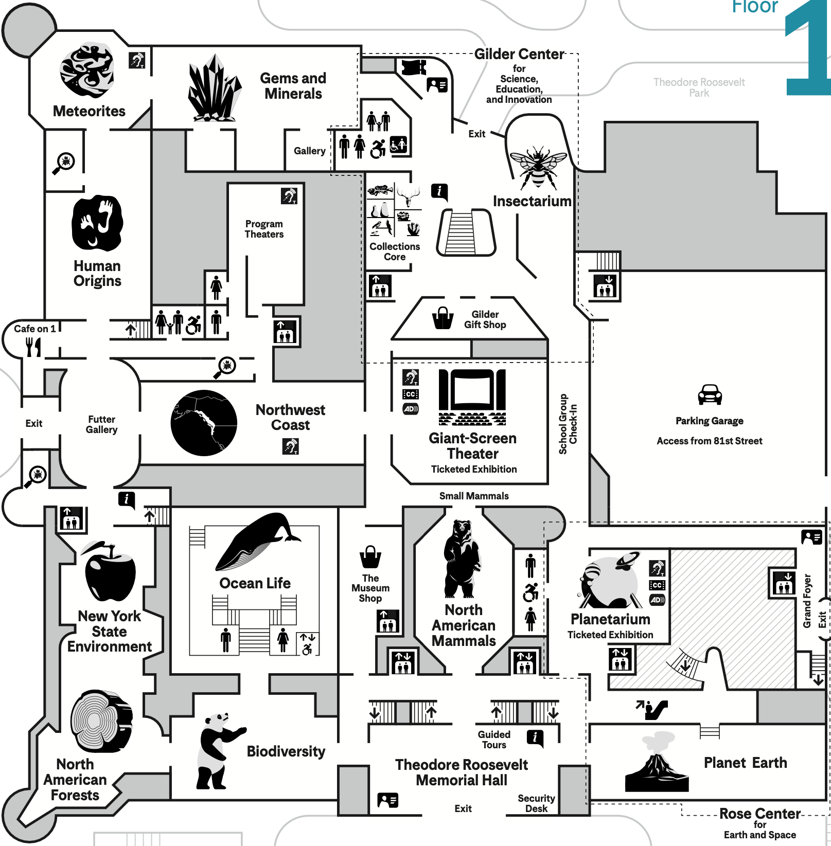
Imagine yourself designing this layout. Here are your requirements:
- You have to tie together 14 exhibits covering the living (insects, mammals, ocean life, forests), the non-living (gems, meteorites, the solar system), and the abstract (biodiversity, human origins) into a coherent journey.
- You have to consider 20 entrance and exit points to the both the exterior and the interior (stairs, escalators, elevators). The visitor's journey can begin or end at any of these points.
- And amid all of that, you must ensure a visitor never feels lost!
That last one is the big one. How do you design this journey in such a way that the visitor never feels lost? This is very similar to the challenge we face when designing the user experience of a complex application.
Wayfinding
Back in my college days, I participated in a wayfinding exercise for the Caltech campus. That experience exposed me to the concepts designers use to help people navigate an environment. Since then, my understanding has solidified into three principles: location, organization, and exploration.
Location
In any environment, you need to know where you are. You've seen a map that has a "You are here" marker on it. Great! You know you're "here" – but where is here?
You probably looked around the marker for place labels, and then you scanned your environment for signs that matched the labels you saw. When you headed off to your destination, I bet you used more signs as landmarks to orient yourself and confirm you were headed in the right direction.
When we understand that people navigate an environment this way, we think about the signs and landmarks they'll use to identify places. Are they visible? Are they readable and understandable? Can people orient themselves within the environment?
Organization
Even if people can identify the places in their environment, we can help them further form a mental map of the environment if the places are organized in a logical pattern. Consider the 174-building UCLA campus, which is divided into a residential area to the west, an athletics area in the center, social sciences and humanities to the north, and STEM to the south. A student has an idea about where to go as long as their destination falls into one of these buckets.
It's much easier to navigate a location when we can reason about it in terms of high-level abstractions. These abstractions help us reason about the general direction to go when the precise destination is unclear or unknown.
Exploration
It happens to me every time I visit a foreign city: I know where I am, I have a sense of where to go, and I have some landmarks to look for along the way. I'm ready to head off on my journey! I turn two corners and I'm already lost.
With enough people navigating an environment, someone is bound to get lost at some point within it. What matters is that they're able to find their way again. The key to this is to instill in people that it's safe to explore. This principle is sort of a function of the first two principles:
- Location enables experimentation. When you know what the consequences of various choices are ahead of time, you gain the confidence to try them out. A sign tells you what's on the other side of a door so you won't be surprised when you open it.
- Organization enables backtracking. When you can recall where you've been and how you got to where you are, you can retrace your steps and try a different route. Eventually you'll end up where you want to be.
Navigating applications
I'm not the first person to draw parallels between navigating physical environments and digital ones. During my research for this post I came across a paper from 1998 in which the authors analyze the similarities far more rigorously than I have. They even use a museum as a metaphor!
Time and place are two common attributes used to sequence material in this fashion. Time places the material in the context of external events and can illustrate causal relationships between events. Navigating through time by traversing a spatial timeline can create a narrative: a story to tell, perhaps communicating the messages outlined in the first principle. This was used to order a series of biographical exhibits at the John F. Kennedy Museum.
– Design Principles for Navigable Information Spaces (Foltz and Davis, 1998)
If you're designing a user interface, you're thinking about the single page someone is looking at. You can probably design this with a wireframe or static mockup. You're designing in space.
But when you start thinking about the application as a whole, you start thinking about all of the transitions between the various pages and the various states enabled within each individual page – all the drawers, models, tabs, and accordions that can alter the information and actions available on that page.
Now you're designing in time, and this is where wayfinding principles matter. As you do so, ask yourself:
- Can users orient themselves within the application, within every page and state of the application?
- Can they identify "landmarks" in the form of titles and navigation elements like nav bars and tabs?
- Are pages organized and presented in such a way that users can intuit what they'll find "behind the door"? Card-sorting exercises can help with this.
- Do transitions between pages and page states (e.g. tabs, drawers, and modals) correspond to new URLs in the browser history, so the user can easily backtrack with the browser's "Back" button?